Collected work of Alex Yu, Visual Artist based in Seattle, graduated in 2019 with a BA in Interdisciplinary Visual Arts from the University of Washington Seattle. Currently working for AAS degree at Seattle Central College in Apparel Design and Development with emphasis on Technical Design and Manufacturing. Artworks include the following formats: Installation, Illustration, Digital, Photography, Cyanotype, Screenprinting, Monotype, Natural Dyeing, Weaving, Felting, Sewing, Knitting, and Wire Sculpture.
Residencies:
Carrie Able Gallery July 2022 - August 2022
Past Exhibitions:
END TO END Senior Exhibition Sandpoint Gallery Flex Space 233D March 1st-15th, 2019
Jacob Lawrence Gallery Graduation Exhibition May 14–25, 2019
Small Works Exhibition, Art Building, University of Washington May 29th, 2019
Prism: UW Senior Art Show University of Washington Odegaard Library May 31–June 11, 2019
Luke-Wing Museum JamFest Exhibition 2019 July 18th, 2019
My new pieces, “The Vessel” and “The Vines”, are companion works that together represent the complex dynamics formed within a blossoming romantic relationship. Respectfully a painting and a soft sculpture piece, the pair takes into account my previous work as a printmaker for art and fashion by emphasizing movement in line and dimension. While my past works have focused on addressing antiquated shapes in a modern context, my new works attempt to marry my appreciation for line and form with a matured sense of emotional expression.
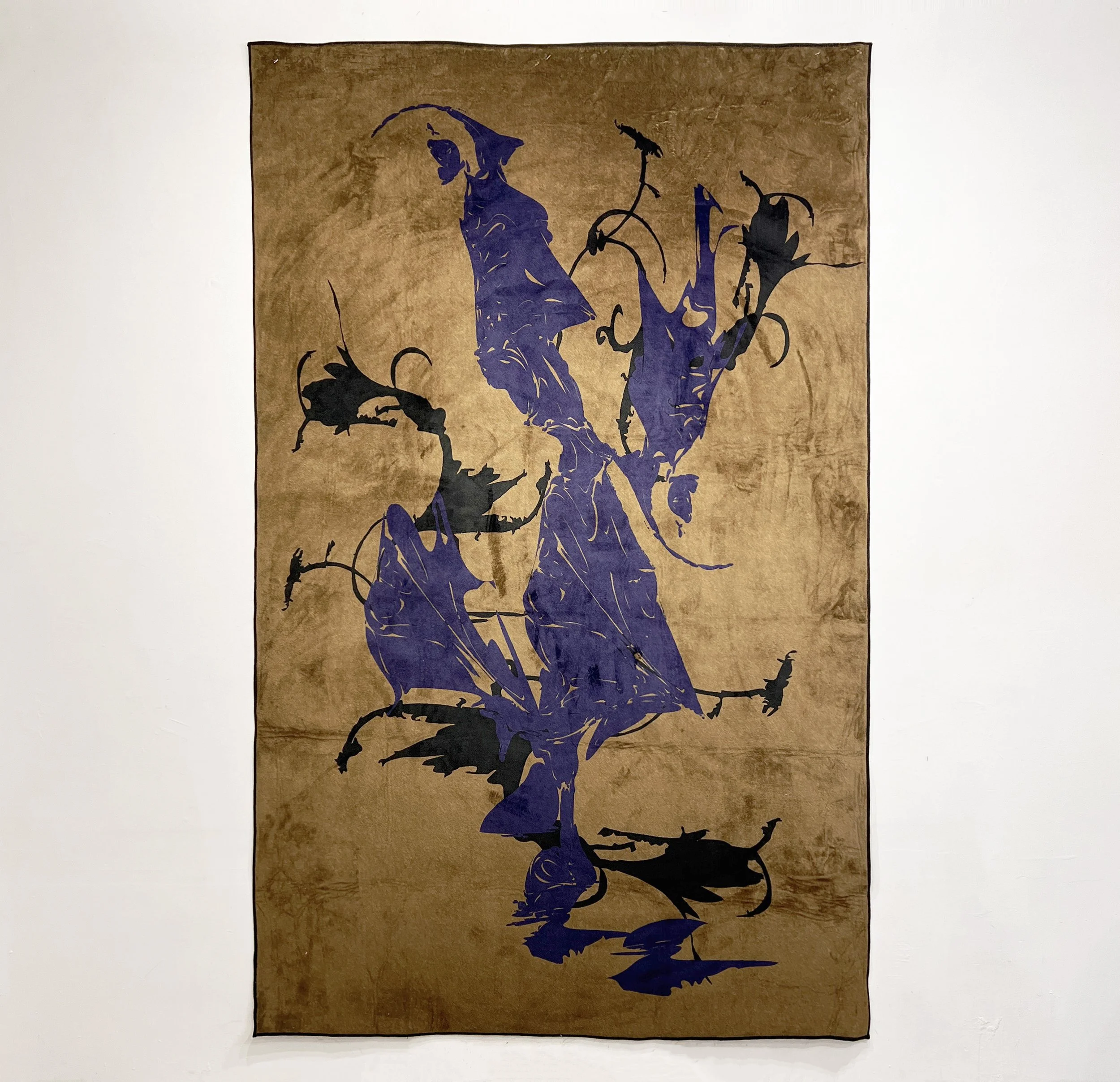
In recalling the personal experiences of maintaining balance inside a new relationship, I was immediately fascinated with the “pull of attraction and vulnerability” but also the accompanying “push of resistance and fear” that must coexist with the former to function correctly. Respectfully, these concepts are represented by “The Vessel”, an acrylic painting, and “The Vines”, a draped soft sculpture painting that is treated with gel medium. While the medium of painting expands upon my previously print focused works, the specific use of draped canvas in “The Vines” delivers a sense of impression in its dimension or “relationship history” that is physically wrinkled and put in place by gel medium. This is seen in comparison to a more traditional and clean painting presentation in “The Vessel”.
Motifs throughout the work are inspired by the fragility yet simultaneous strength of plants. Whether it’s the delicate coiling lines within “The Vessel” or the surrounding bold and jagged pillars of plants in “The Vines”, the compositions retain a sense of asymmetry which indicates a differing of experiences within the participants of a new romance. While the future of the pairing is unclear, the forces acting upon the romance highlight the importance of embracing the present.
Selected Digital Print Works, 2022
Ideas mix unconventional and unrelated objects that are illustrated and warped into new ideas.
Print design project for proenza schouler 2023. I loved the idea of an extremely colorful tone that also maintained the serious and modern proenza aesthetic. I eventually settled on print exploring working methods and landed on digitizing my own ink drawings to display an artistic undertone into the season. I liked this idea of prints which aren’t easily recognized at first, until they are looked at closely, separating themselves from concepts that are already explored. Also includes my print and color research in the former slides.
General Research of print trends for women’s designer labels
Conceptual project based on brand research and adding new concepts for a future season. Projected season based on comfort, home, and coming back from the pandemic. Here were my notes: Brand seems to reuse lots of the same palettes, but changes hues. Very solid color garment pieces, which are refined. Including things like complementary yellow vs purple, blue vs orange. They like playing with a lot of the same key colors but changing hue by adding midtones each season. I want to add a soft element while keeping similar branding. White, yellow, and black remain the most similar. While some of my proposed colors are more muted, aggressive solid color usage will accommodate as they colors can be worn together.
Collected inspiration images from personal archive that represent separate seasons, color stories, and potentially different collections if further explored.
A digital series regarding the pandemic and social distancing sociology, with references to: bird flying formations, ancient Chinese calligraphy, and surrealism.
Digitally reconfigured and skewed silhouette of a vintage tiffany’s necklace reference that introduces modern surrealism to vintage design concepts and ideas of beauty.
Small series regarding texture and body skewing themes
Part of a mini series I made to close off of this year of 2020 in reflection. In my growing maturity as a creator, a union between fate and the continual mystery of the universe is decided. Featuring themes of runic constellations and medieval calligraphy.
2019
Digitally Prepared and printed 5x7 in editions of screen printed designs based on dreams. Asymmetric and hazy natural elements are brought into a clearer perspective with use of a bold red square.
Explorations of digital portraiture work with use of color.
Digital
2019
Explorations into digital contortion and abstract shapes.
Wall installation of dye sublimation printed 3 by 8 ft fabric hangings. Presented during Jacob Lawrence Graduation Exhibition. Prepared digitally. Representing unconventional body types and character in relationship to standards of beauty and the laws of attraction.
Experimental pieces exploring the use of digital photography and color manipulation
Showcase of some of my craft skills and experience with loom weaving, natural dyeing and knitting. Some examples: tied iron-mordanted cochineal variated yarns, dyed by steam, and plain woven by loom. Natural dyeing experiments including custom mordants and over dyes with natural indigo banana vats. Experimentations playing with multi dye vat dips and washes on natural fabric samples. Yarn dyed vs garment dyed knitting experimentations.
Inspired by Francis Bacon’s crucifixion paintings, this piece plays with ideas of form and violent beauty.
The concept of my work is rooted in portrait photography. Subjects of portraits such as for school are all told smile when sitting for a photo. I’m interested in the contradictory themes of capturing the moment in a person’s essence but also not authentically, by forcing them to pacify in front of the camera. This dichotomy is represented in my work in my mark making, which contrasts chaotic lines and facial features with simpler heads and shoulders. All portraits have a mask-like quality to them, while some have stretched or multiple features; subjects are internally fighting with pacificity of the photograph. With the usage of similar hair color and haunting masks, the group of figures represent a common conflict of the heart in sitting for a school portrait photo. These features were inspired by the 1960 film, “Village of the Damned,” in which passive but eerie kids with similar hair color are the focus of the film. My process started with drawing portraits on paper with pens and brush pens and scanning them. Facial features of the drawings are then cropped and collaged on the portraits, in a messy collage style. This messiness is intentional to juxtapose with the simple and still gesture of the portraits. Drawings are then turned into transparencies and completed with the cyanotype process. Cyanotype brings a heavy contrast to the portraits that support the theme of dichotomy but also allows for exact and sharp details from the drawing. Drawings are cut with a slight border and mounted on a piece of paper in two rows to mimic the presentation of portraits in a yearbook.
A monotype series focused on beauty that is hidden behind layers of "ugliness". Some fine details include hand water colored butterflies, hidden human-like figures, and butterfly stencil work.