

Collected work of Alex Yu, Visual Artist based in Seattle, graduated in 2019 with a BA in Interdisciplinary Visual Arts from the University of Washington Seattle. Currently working for AAS degree at Seattle Central College in Apparel Design and Development with emphasis on Technical Design and Manufacturing. Artworks include the following formats: Installation, Illustration, Digital, Photography, Cyanotype, Screenprinting, Monotype, Natural Dyeing, Weaving, Felting, Sewing, Knitting, and Wire Sculpture.
PLEASE VISIT PRINTS AND COLOR TAB OF WEBSITE TO SEE ARTIST PRINT WORK
Residencies:
Carrie Able Gallery July 2022-Aug 2022
Past Exhibitions:
END TO END Senior Exhibition Sandpoint Gallery Flex Space 233D March 1st-15th, 2019
Jacob Lawrence Gallery Graduation Exhibition May 14–25, 2019
Small Works Exhibition, Art Building, University of Washington May 29th, 2019
Prism: UW Senior Art Show University of Washington Odegaard Library May 31–June 11, 2019
Luke-Wing Museum JamFest Exhibition 2019 July 18th, 2019
My new pieces, “The Vessel” and “The Vines”, are companion works that together represent the complex dynamics formed within a blossoming romantic relationship. Respectfully a painting and a soft sculpture piece, the pair takes into account my previous work as a printmaker for art and fashion by emphasizing movement in line and dimension. While my past works have focused on addressing antiquated shapes in a modern context, my new works attempt to marry my appreciation for line and form with a matured sense of emotional expression.
In recalling the personal experiences of maintaining balance inside a new relationship, I was immediately fascinated with the “pull of attraction and vulnerability” but also the accompanying “push of resistance and fear” that must coexist with the former to function correctly. Respectfully, these concepts are represented by “The Vessel”, an acrylic painting, and “The Vines”, a draped soft sculpture painting that is treated with gel medium. While the medium of painting expands upon my previously print focused works, the specific use of draped canvas in “The Vines” delivers a sense of impression in its dimension or “relationship history” that is physically wrinkled and put in place by gel medium. This is seen in comparison to a more traditional and clean painting presentation in “The Vessel”.
Motifs throughout the work are inspired by the fragility yet simultaneous strength of plants. Whether it’s the delicate coiling lines within “The Vessel” or the surrounding bold and jagged pillars of plants in “The Vines”, the compositions retain a sense of asymmetry which indicates a differing of experiences within the participants of a new romance. While the future of the pairing is unclear, the forces acting upon the romance highlight the importance of embracing the present.
My hand-woven tree trunk wire sculpture continues my past wire and textile works. Like my previous work, this piece commands a realistic dilemma between the nature of beauty and ugliness. The form of the piece is heavily inspired by the gravity and pull of the earth on a weakened nature in the future. Only the remnants of violence exists, having been torn down, pressed, and pulled by the seams but in memory. Repetition in the piece’s varied, dense, and continuous quality recalls an arduous gathering and gifting of “built” energy. Lines of wire are made to be uneven, yet all point to their clearly addressed directions. The resulting piece should present an interesting dilemma between manmade and natural references imbued with a cumulative power.
The name of the piece is based on the Greek myth of Apollo and Daphne, involving Apollo’s predatory pursuit of Daphne. She requests to be turned into a tree to avoid further violence. Apollo’s masculine aggression is subdued by Daphne’s feminine vows of chastity.
Emotional inspiration for this piece came from my personal research on the parallels between dance and sculpture. I was especially interested with the work by Mary Wigman, Pina Bausch, and their influence for the dancing in 2018’s Suspiria. Their work is critical of traditional narratives of feminine beauty in dance. Especially interesting is their focus on the aggressive strength and weakness in immense endurance alongside its representation as a true love of craft. The process in which my piece was created therefore had to attempt the same aggressive physical and emotional endurance. Historically, dance and fiber arts, traditionally women’s work, such as weaving didn’t gain recognition as art until done by men, which puts an interesting perspective regarding feminism into my work. It is after all, “woman’s work” done by a man.
June 2019 6ft by 4ft by 2.5ft
A refined continuation of previous photo work regarding topics of suburban nightmares and horrors
Digitally-altered Photography of previous Fallen Installation, reconstructed to fit the narrative of John Clare’s “I Am” Poem.
2018
Ink on Mylar and Chair
Inspired by contemporary dancer Pina Bausch, my piece aspires to mimic a similar sense of perpetual movement in a static form
A piece exploring the organic and manufactured elements of wire in opposition of natural tree forms, which are referenced and contorted. 3x3x3 Ft. Dec 2019
Done on Ipad
A project based on tension of knitted string. Printed photographs are arranged and collaged.
Project based on mounted white found-objects on the wall. Fabrics are draped with care that blend together aspects of gesture that allows the piece to be 3D while also being 2D.
A three sheet 3x4 feet frosted mylar graphite drawing inspired by my Alien wall piece. Frosted Mylar allows for the use of transparency and build up of value. Layers of shifted to give the piece a sense of movement.
My piece represents the at times chaotic nature of a traditional home for me. It’s ambiguous if the shape and color is reflective of the “house” as a modern home or a flimsy tin shelter. This duality is reflective of the nature of the home I live in, where the idea of home and therefore family, is built on aesthetics rather than actual substance and support. The piece is near and off the edge of the table to represent the near collapse of the “house” and the family system. The outside of the piece is covered in eyes and lips, which represent the judgement of others or rather the nature of “home” and family being dictated heavily by what others think. My home is therefore literally defined by others views of my home or family, when you convince yourself that you’re only defined by what others think of you. The image of the man on the inside represents certain people of the family or home, who develop an internal conflict between their true selves and their duty to maintain a role in the family. In their conflict, they become literally two-faced. The two-faced figure keeps building support up with a more concrete piece of wood. The oversaturation of eyes is seen coming from the bottom to suggest a consuming quality within the family or home.
The nature of the structure being three dimensional allows for viewers to get a look at it from multiple angles. This is important because the nature of the structure is very empty, bare, and flimsy. The boxes being slanted at many angles suggests an instability throughout the structure. Viewers get a sense of the building being very complexly structured by also very bare. The interaction with the side of the table it’s installed on makes the structure seem on the edge of collapse.
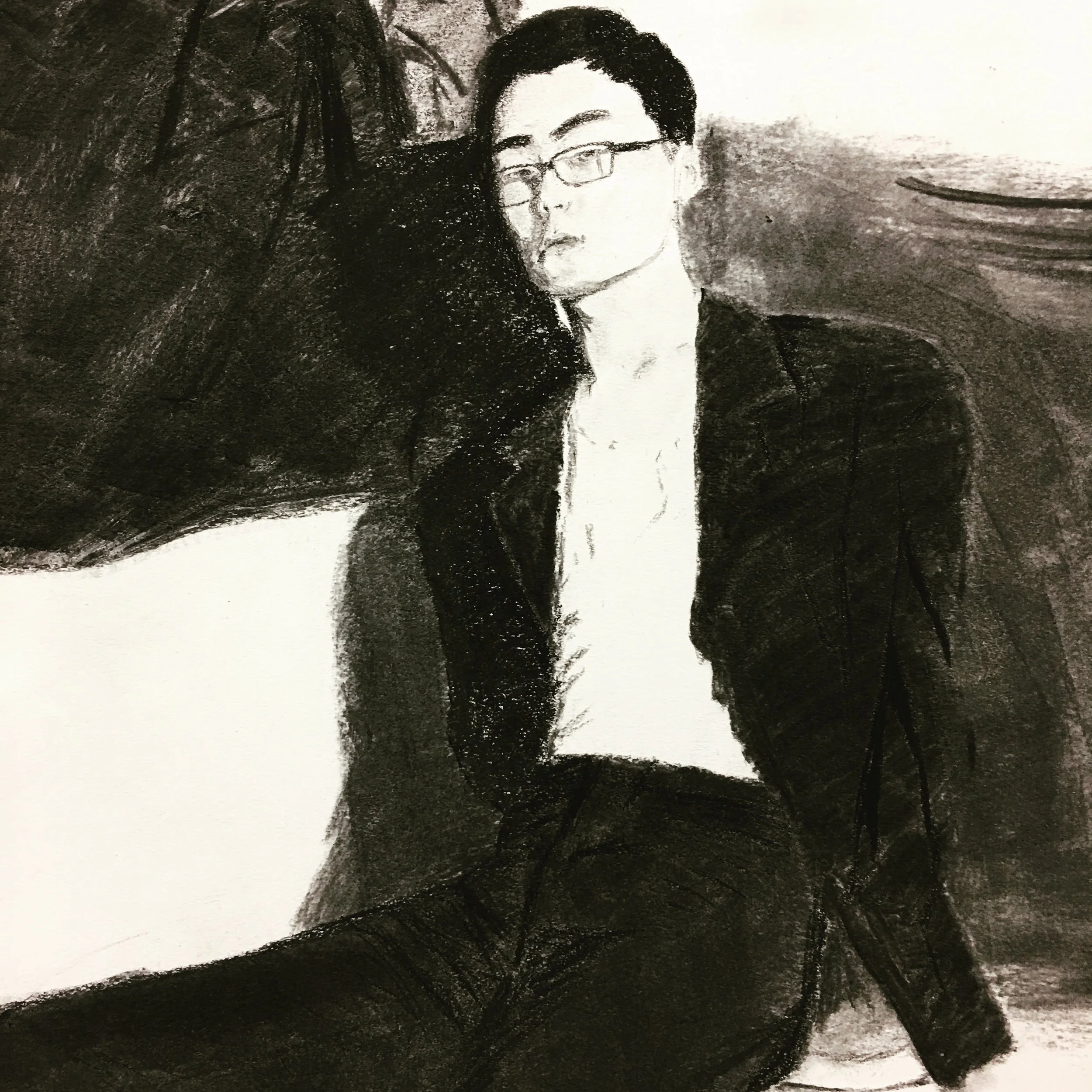
Reference charcoal work
24 ft by 8 ft installation from 500 sheets of paper. My house structure was based on my family being defined by the opinions of others while the idea of home became very unstable, as unstable as my box structure. My paper project is based on the same idea. The paper flowers, more structured in the middle represents the beautiful facade of my family unit. Being defined by the opinions of others (usage of eyes), the flowers become more and more destroyed from the outside, which is where more eyes are located. Deformed flowers become more and more skewed and unrecognizable, metaphorical for the family breaking more as it is more defined by the views of others. Coal is sprinkled into the installation to promote an acute sense of decay, while redefining folded details. Ultimately, the flowers are crinkled paper or trash, metaphorical of the facade of an ideal traditional family.
Use of carefully folded paper installed on a large scale encourages viewers to walk around and observe the entirety of the piece. This is also aided with the acute sprinkling of coal that can be seen in the flowers. Carefully mirrored but not the same halves of the piece encourage viewers to compare both halves. A skewed gradation on both sides encourages viewers to follow the composition with their eyes.
Self Portrait
Recently, I’ve been personally working my art towards the goal of altering or slightly destroying the aesthetics of my work. It might be introducing themes of ugliness into beauty or altering scale and space. In this case, I’m basing my scroll on top of one of my wall installations and playing with themes of space. My wall installation worked with ideas of transforming two dimensional paper into a three dimensional piece that was still vaguely still two dimensional. At the same time, it played with a shifted scale, as “paper flowers” gradually got more and more skewed and deformed at an angle. With my accordion book, I’m inspired by my same installation. Individual folds of the papers are not referenced. Instead, the shadows are connected with directional curves that provide a sense of flow and space on a two dimensional drawing. Shadows have a strong focus on the center while more and more shadows are “missing or cut out” towards the end with subtle detail, as they are also being deformed. Flowers between the center and the edges are drawn with vaguely similar but different silhouettes, intended to give off a sense of pause and movement while in place.
Visual flow of the piece is directed by the directional slants from both sides facing the middle. The abstract shapes become bigger and more 90 degrees towards the sides. Subtle detail of the cut shapes gradually increase from the middle to the outer edges of the piece. Drawings are placed in a “n” shape with slits of blank sheets of paper between every other drawing to give an altered sense of space that is both two and three dimensional. Viewers are forced to look at every drawing at a certain angle to correctly align the drawings by eye.
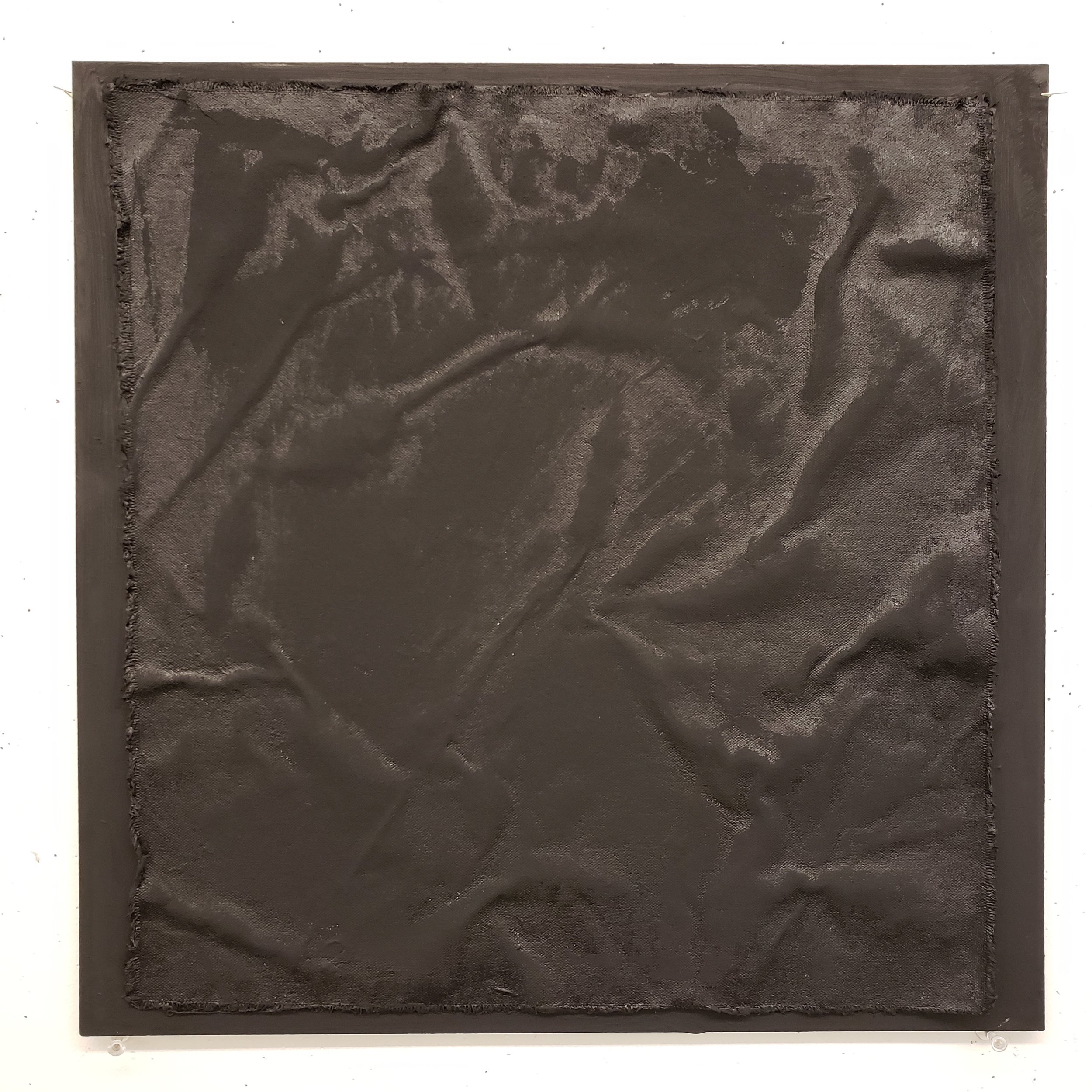
Recently, I’ve been personally working my art towards the goal of altering or slightly destroying the aesthetics of my work. It might be introducing themes of ugliness into beauty or altering scale and space. This is related to my time piece as it deals with disrupting the stable state of canvas fabric, ironed out and flat. My piece will be ten sheets of 15x15 canvas on 16x16 poster board all painted black. There will be a gradual “oscillating churning” progression from boards 1-7 and climaxes at 7 and unfolds to piece 10, which will be flat again. Each progression is similar but not a direct progression because it simulates the possibility of random shapes formed when turned the opposite direction. This series is a representation of coming full circle in life but having a deep impression, shown by the wrinkles on the last piece. First pieces are painted just in matte paint and last pieces are wrinkled and applied with gloss paint to show an element of dirtiness that also highlights the detail of shadows in wrinkles.
The idea of time is important in this piece. My decision of the higher ratio of the gradual “oscillating churning” progression makes the impression of wrinkles more dramatic to the viewer. If I were to have a 5 to 5 ratio, my piece would have too much balance. The drama of wrinkling through time is more effective if the fabric is churning between each panel like a washing machine, twisting in one direction before twisting in the other direction more intensely. Panels 1-4 have a calmer turning motion and a peaceful folds, while panels 5-7 have a more intense turning, flatter folds and stronger progression of gloss “dirtiness”. These gives panels 5-7 more of an irredeemable quality than 1-4, that is presented full circle in the final panel. The black paint and gloss paint brings out the curves of the fabric more but also adds a unifying depressing or devastating attitude to this piece.
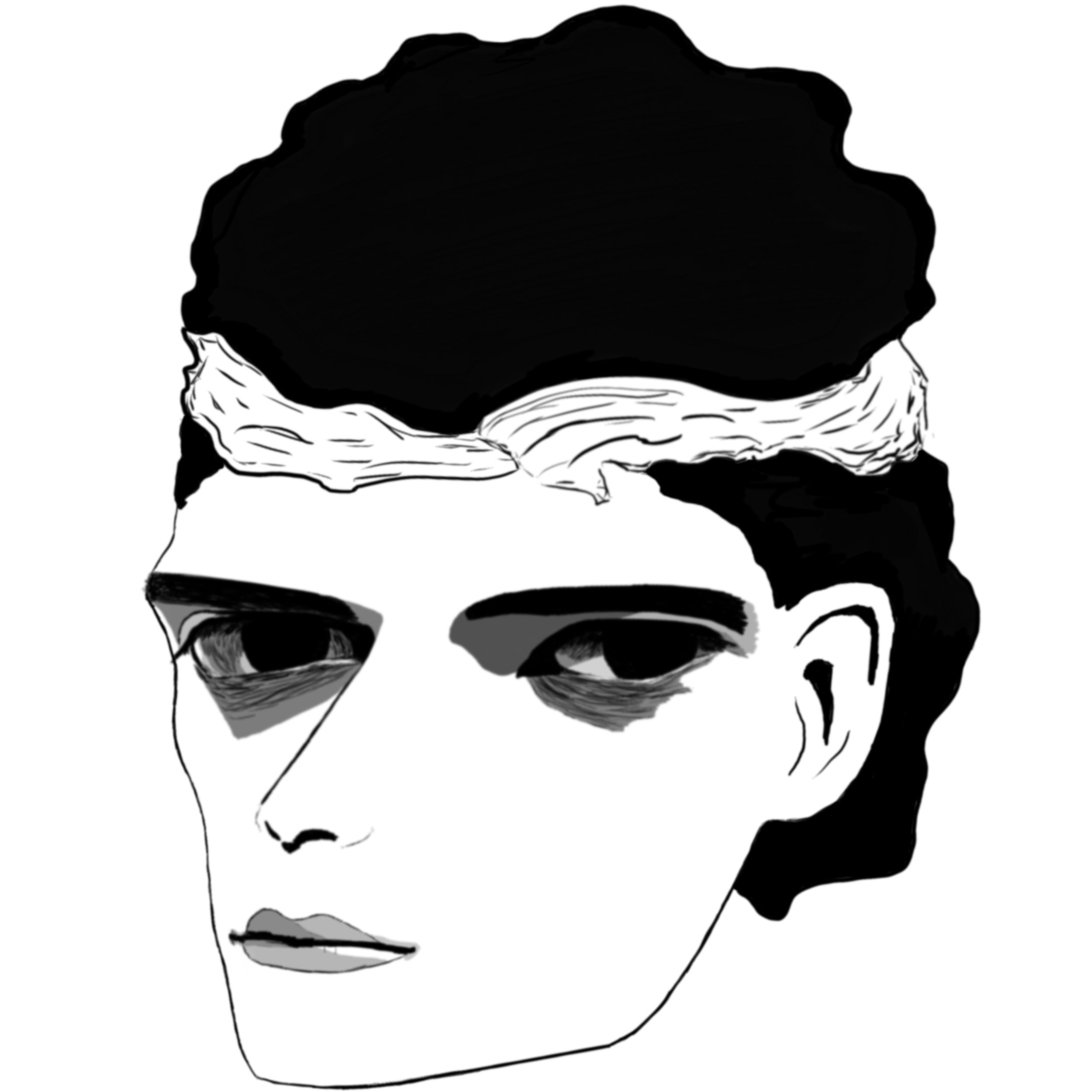
A selection from my many drawings, an exploration of styles using marker, pen, brush pen, and digital.
An exploration into concept of nightmares, haunting yet extremely differing and varying in effect.